This is a #throwback makeover, from a couple years ago. My task was to choose paint color, carpet, and design elements for the Designer Bath conference room, where we often hosted invitational Lunch + Learns for the design community.
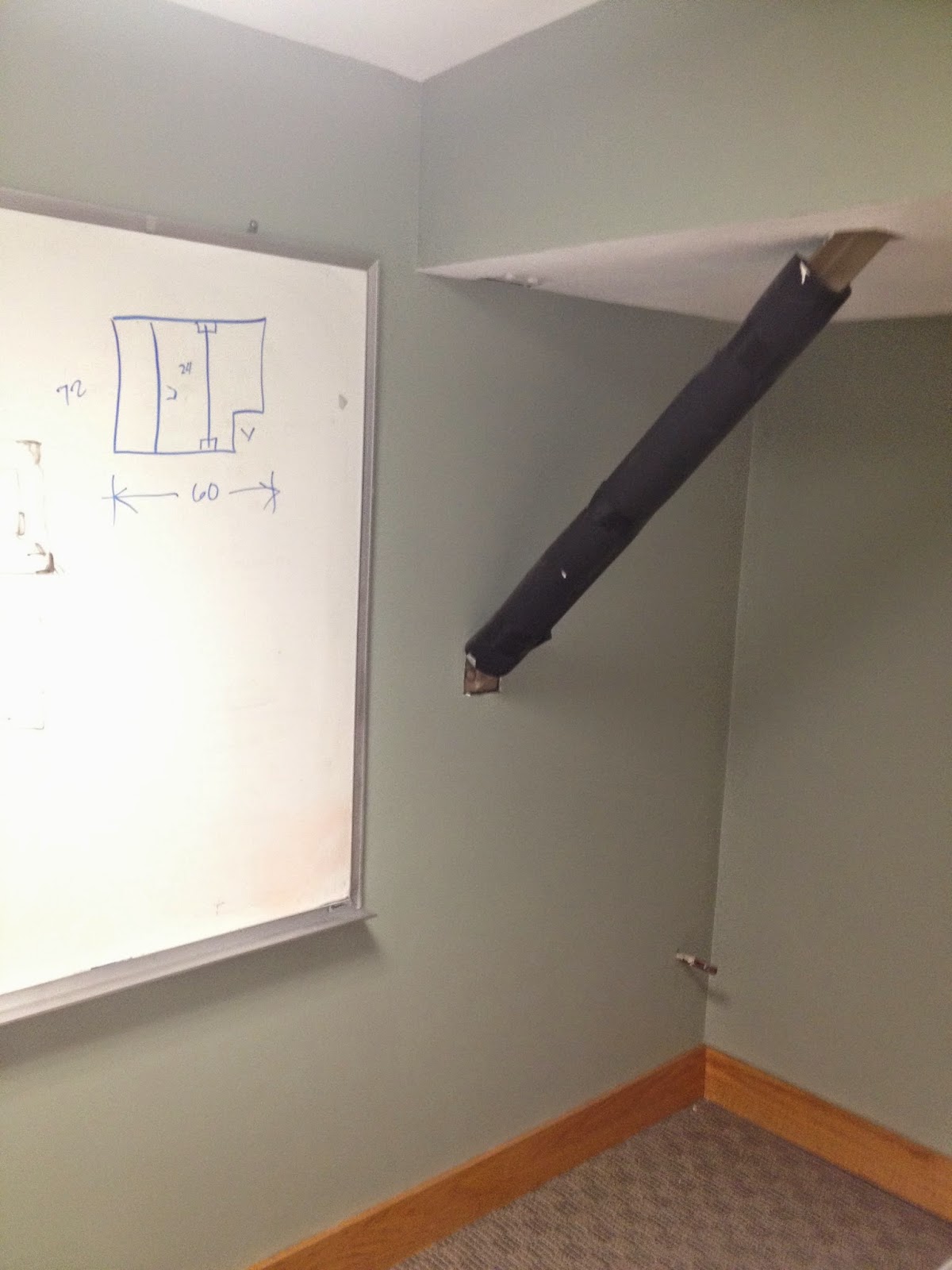
Above is the “After.” Below is the eye-sore before ...
This support beam posed the biggest challenge. After much thought, simply wrapping it tightly with rope created an interesting texture in the room, while referencing the company’s early years when still located in the seaport town of Salem, MA. The decorative orange tree, taking a cue from the company’s brand colors, adds brightness and life to the corner of this window-less office space.
The new paint colors for the walls in the conference room and adjoining cubicle area both had to coordinate with the new commercial grade carpet we chose from Landry and Arcari.
To finish the space, cut vinyl was added to the conference room walls. On one side, the Designer Bath logo in white, and on the monitor wall we added a reflective wave pattern taken from their Salem Plumbing logo.
At my new position at White Light Visual, this is the type of project we are often called upon to design and execute – branding corporate, retail, and institutional environments through “visual marketing.” To me, it’s just another form of art.


No comments:
Post a Comment
Thanks for visiting! I would love to hear your thoughts on today’s post. Please note: all comments will be reviewed before being published to protect readers from spam. Thank you!